

A Critical Look at Ecommerce CTAs: What Works and What Lacks

An inspiring call-to-action is equal parts design and psychology. Prompting the desired response is never easy, especially as consumers become savvy to the tricks and tactics that online retailers use. The last thing you want is for your CTAs to be labeled “click-bait,” but you have to get buyers to convert somehow, right?
We’ve shared a lot of tips over the years for creating compelling CTAs. While some of the components may change a little over time, the basic requirements remain. An image of the product or service, some compelling copy, and a button that stands out from the rest of the CTA are all must-haves.
What happens when any of those pieces are missing? Let’s take a look.
Sub-Optimal CTAs
One might think ecommerce giant Amazon would know a thing or two about CTAs, but a quick visit to their site shows they’re either ignoring the basics or trying to change the game.
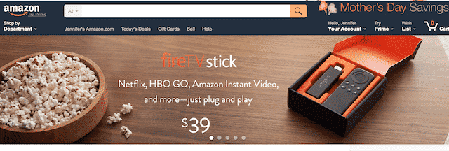
There’s an image, sure. There’s also some fairly compelling copy. Where’s the directive? The whole image is clickable, but without some hint for visitors, who would know that?
This CTA from Target is also a little disappointing. A retailer with Target’s reputation for style and flair should probably have a better call-to-action game going.

First of all, while mildly clever, “save a bundle” is hardly compelling. The button, which is actually present here, is off to the side in a boring gray that does nothing to stand out from the rest of the images on the site. The copy on the button also doesn’t really inspire a click, does it?
Then there’s this one from Hot Topic. We love how they’re always edgy and breaking the rules, but sometimes rules are made to be followed.
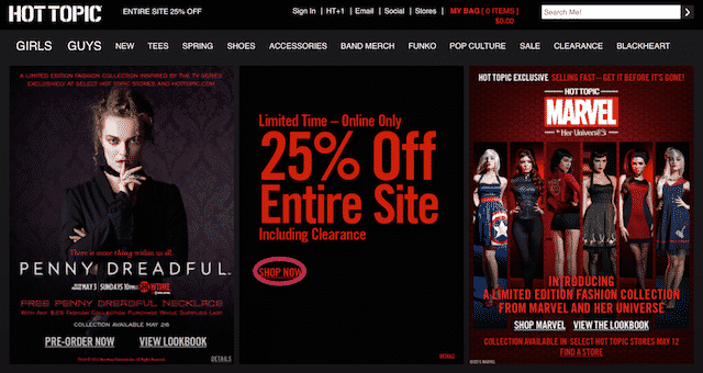
The whole thing is a little busy, with multiple images and text pretty much everywhere. We do get a bit of urgency there in the middle with the “Limited Time” copy and the huge text proclaiming the discount. Why, then, is the CTA in teeny-tiny letters below that—and in the same color, no less?
CTA Bronze Medalists
The Gap stands out as a company that gets things done with their CTAs. This example shows ahero image, some helpful copy, and a very clear button with text that compels a click.

Why do they get a bronze medal? Well, without the circle there, the button wouldn’t stand out from the rest of the design, would it? A bold color in a contrasting color is always a better plan.
Tommy Hilfiger seems to take a page from the same book with their design. Here they are, tied for bronze, with their great hero image, even more clever copy, and CTA button.
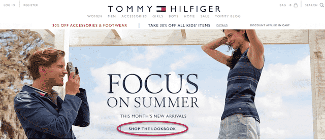
It’s just…the button is so plain. Maybe they don’t want it to disrupt the rest of the call-to-action, but isn’t that the point?
CTA Silver Medalist
Believe it or not, WalMart gets a second-place spot for their CTA. This image from their homepage features bold colors, a timely message, and a button that really stands out from the rest of the images without making the user cringe.

They’d take the gold if not for two things: first, moms usually want something that doesn’t hint at chores or work for their special day (kudos for the jewelry thrown in as an afterthought). Second, someone else managed to beat them by taking the game to the next level.
CTA Gold Medalists
Dollar Shave Club is definitely a winner here, with their huge hero image, fun copy, and bold buttons.
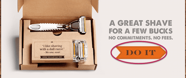
The button doesn’t just use traditional text. “Do it,” is fun, fresh, and really fits the brand. It also prompts an immediate response. Still, another company might just edge them out of the top spot.
Remember when we talked about Hot Topic breaking the rules and failing? Plated used the same tactic and won everything. Here, you can take a look at the screencap, but it won’t show you why they win.
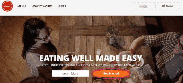
The two separate CTA buttons are different colors. The one they REALLY want the customers to click is a different, bolder color. “Learn more” is still an option readily available, but the true conversion button begs a little louder.
To find out why they win everything, you have to visit the website. Instead of a static hero image, the background of the CTA is a looped video of various cooking and dining scenarios. The movement draws the eye right there and refuses to let the user’s gaze go. That’s how to win a click: Don’t give them any reason to look away.
Now you know what we love and why. What CTAs have you seen on ecommerce sites lately that made you want to click? We’d love to know what wins it all with you.
Written by Morgan Jacobson | @InboundeComm
